Overview
Watermark Insights, an Ed Tech SaaS company, purchased a product called "Via" (pronounced VEE-ah), which was not compliant with current accessibility standards. Not meeting these standards was affecting sales of the product, so this update was a high priority. The existing color palette clashed with Watermark's corporate branding, as well.
I was tasked with updating the visual design and user interface with the Watermark color palette using the Watermark Design System components. Watermark’s branding had already established a WCAG 2.1 accessible color palette for most components; however, there were some features unique to Via which needed additional colors and UI elements.
The overall project was to update the entire product with mockups for nearly every screen, but my focus here is just one of the portions that I worked on which required additional design outside of the Watermark Design System.
My role: UI Designer
Goal: Update user interface of acquired product to match Watermark branding and meet WCAG 2.1 guidelines.
Users: Higher education students, faculty, and administrators for the purposes of creating a portfolio of work
Tools: Sketch, Abstract, WebAIM contrast checker, and Slack
Challenges:
- Current design pattern did not meet Accessibility requirements
- Watermark Design System did not yet include components for this content area
Updated Designs
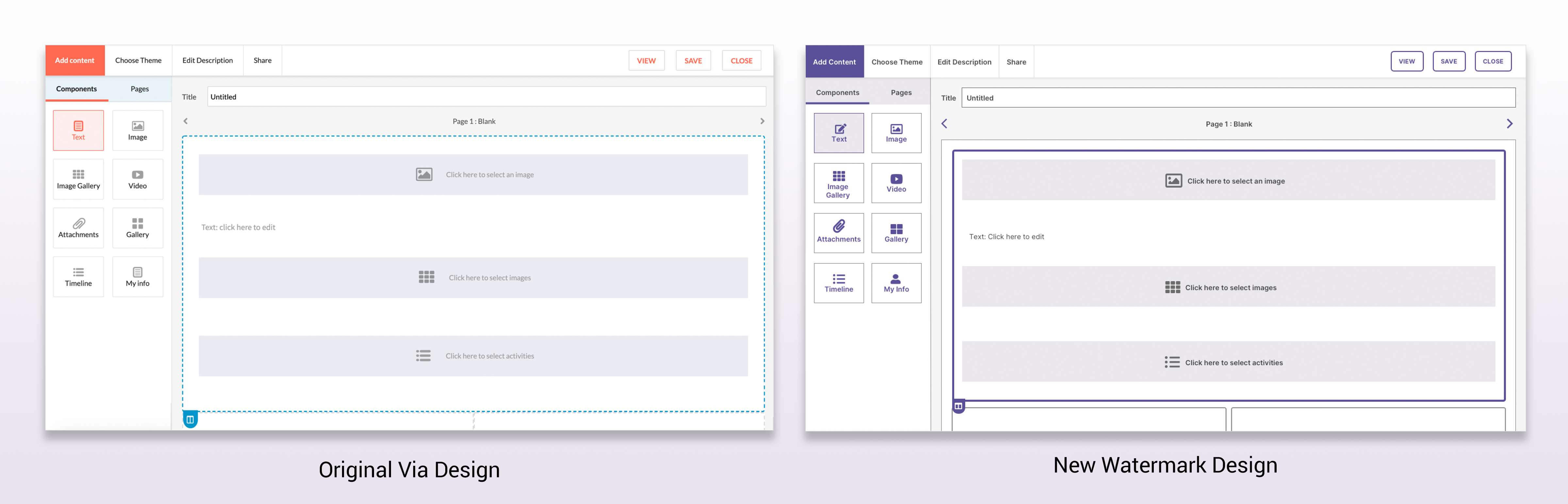
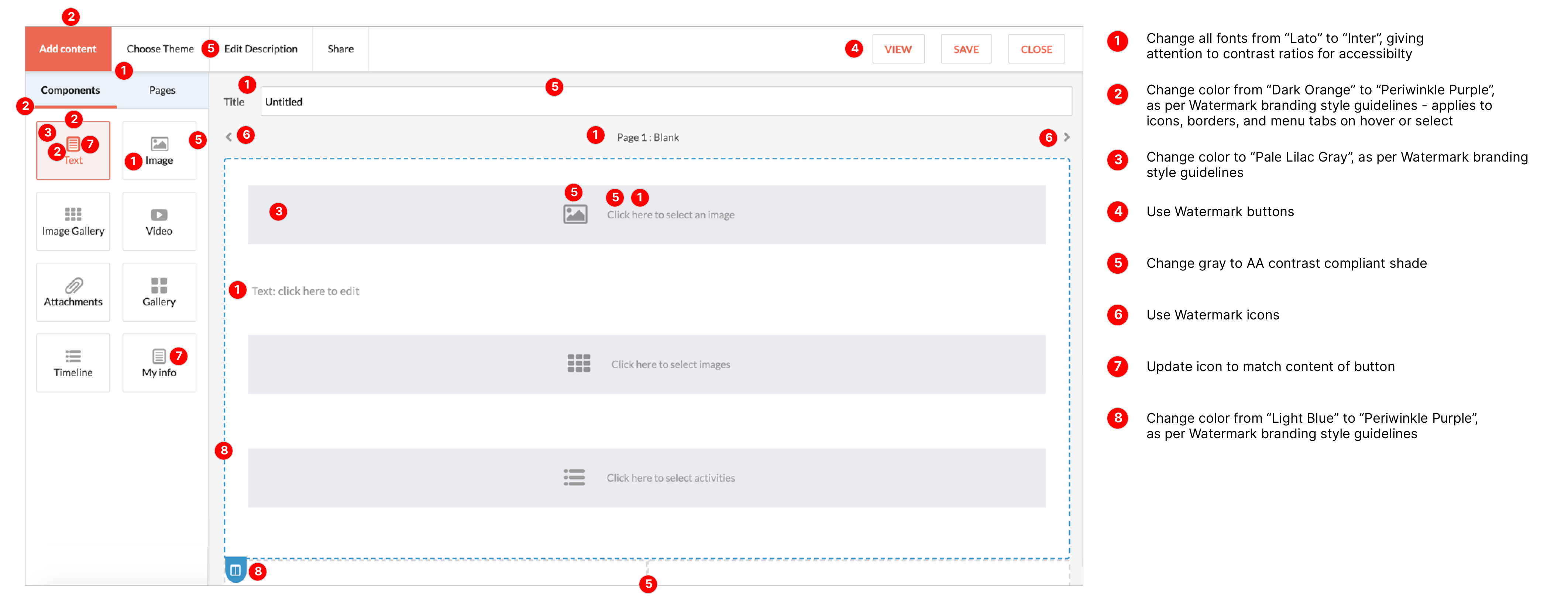
Global changes that were made included the following:
- Updated the font from Lato to Inter
- Changed shades of orange and blue to shades of purple
- Darkened the gray that was used for text and borders to increase the contrast with the background
- Buttons were converted to the standard Watermark buttons
- Changed icon color to purple, and added two new ones.
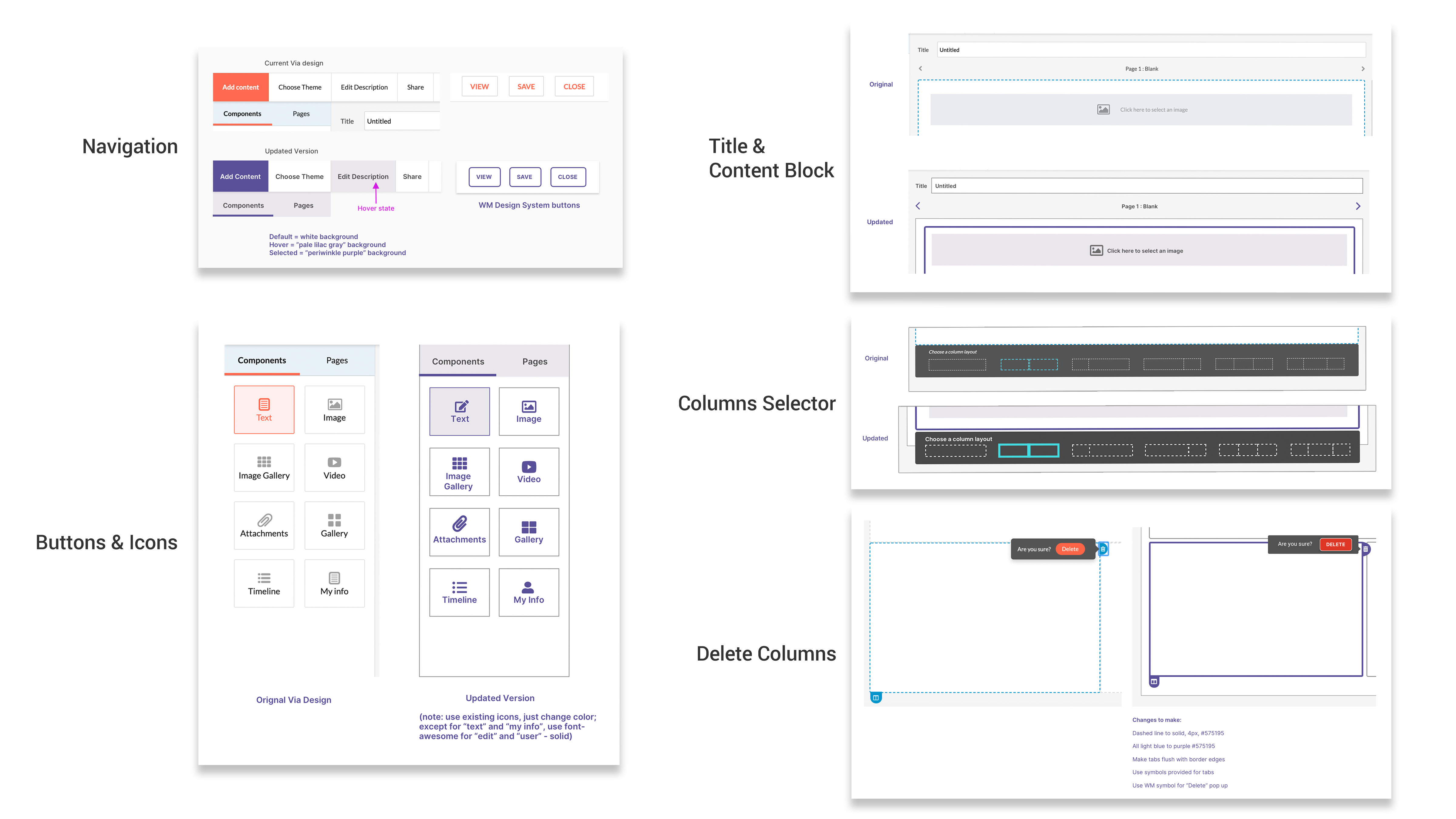
See below for examples of the updates for each of the sections that make up the Showcase page, as preseented to the development team:
(Click to enlarge)
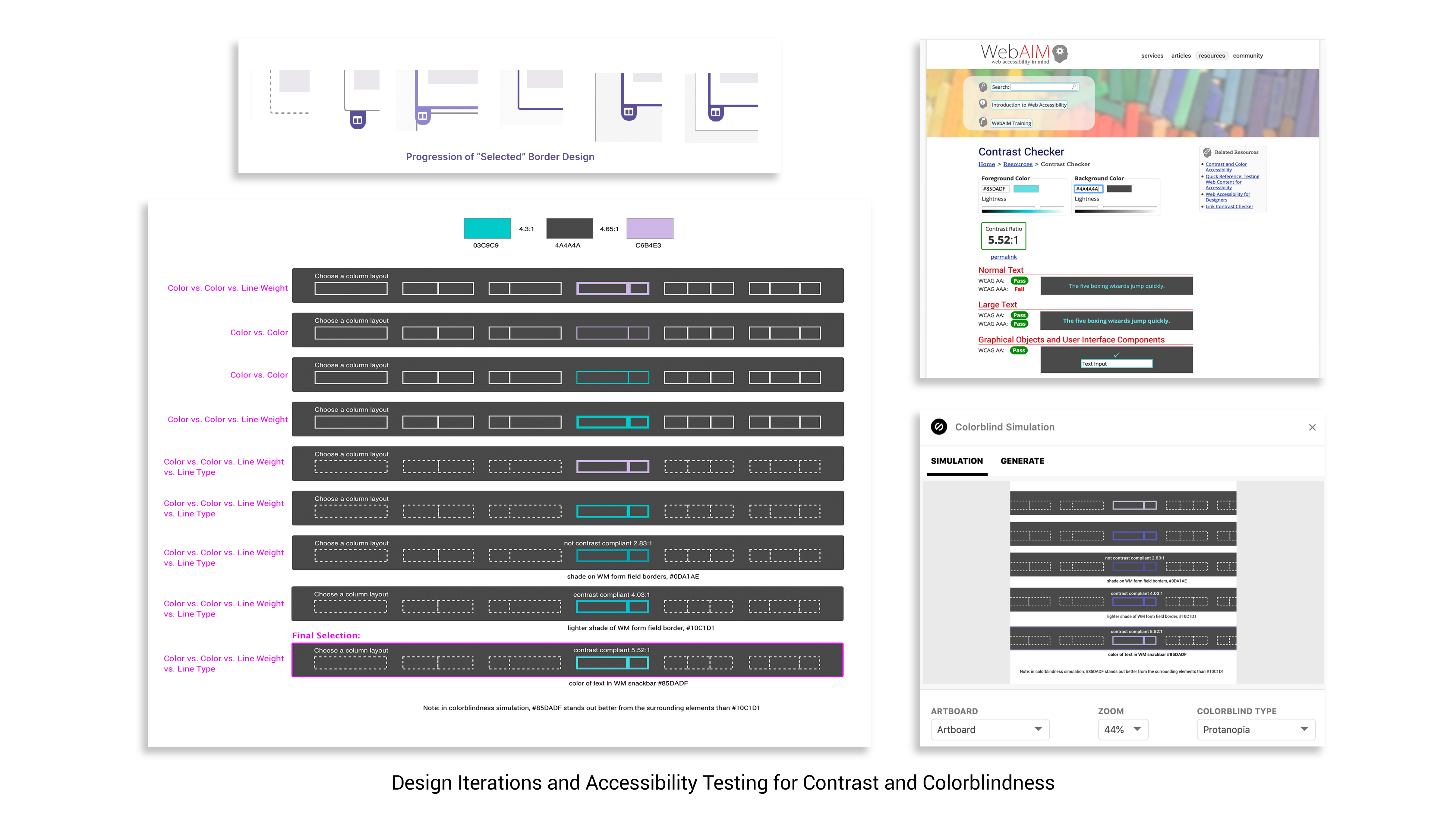
Design Iterations & Testing for Accessibility
I performed multiple tests for both contrast ratios and color-blindness issues using the WebAIM online tool and the Stark plugin for Sketch. A constant challenge was that color combinations might have a proper contrast ratio but not pass a color-blindness test. Or, the colorblind rendering might no longer be contrast-compliant. In areas where the colors were too similar, we were able to use patterns and/or line weight to distinguish between them.
(Click to enlarge)
Project Summary
Details and consistency matter when it comes to accessibility. In order to make sure the entire flow worked, checking the colors, contrast levels, and line thicknesses needed to be done several times for each element. I also learned that validation needs to be done within the context of the whole design system, not just in the immediate surroundings of an element.
See below for a before and after view of the Showcase - Add Content screen updates:
(Click to enlarge)